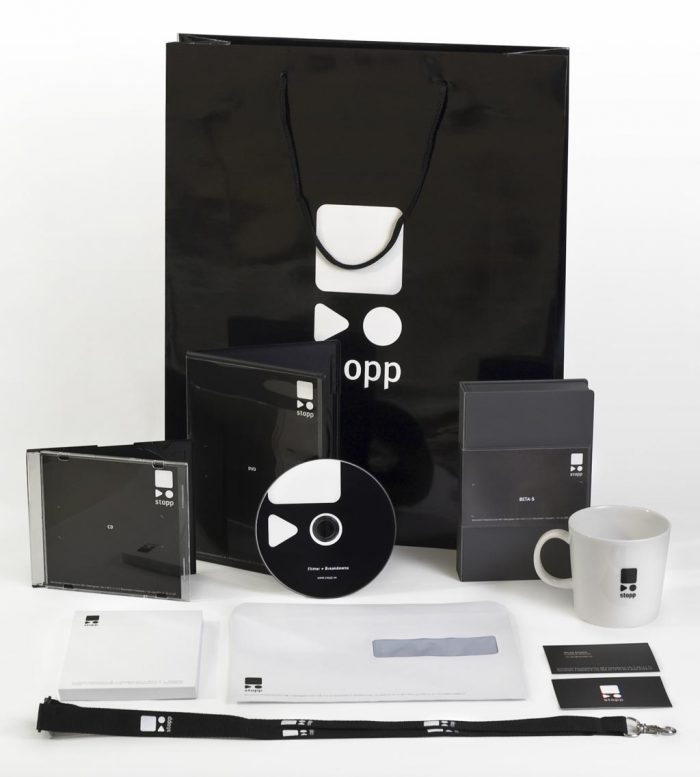
As soon as I started at Stopp we begun working right away on the new graphic profile. This was definitely a big project. The amount of items that go in and out a post production house is huge. From envelopes to videotapes, from bags to mugs, everything needs to be branded.
Quite a satisfaction to see your logo shown around that much, actually.
The color palette is based on the dialectic between screen- and print-based media. White logo on black for the screen related materials and vice-versa for the printed materials. Naturally the white on black version is the official color scheme for Stopp, since the company works with screen-based media like film, video and websites.
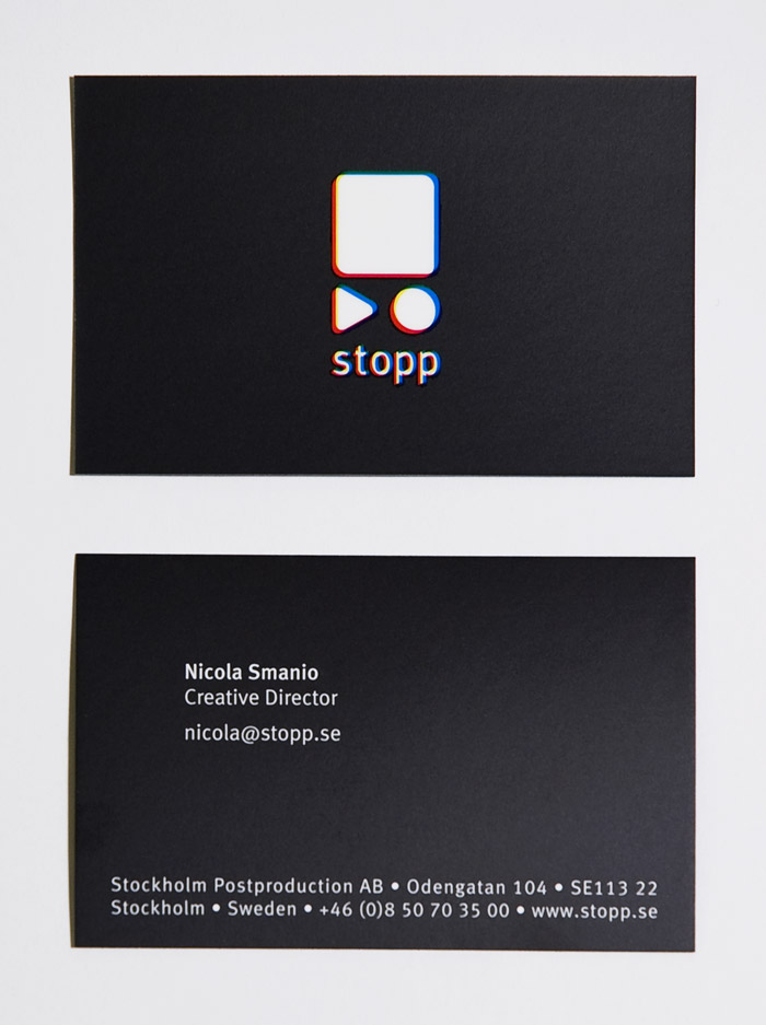
To accent the fact that additive color synthesis is what Stopp works with, I made a version of the logo in which the red, green and blue channel merge together to create the white logo.
On top of the tangible objects we also produced templates and materials for the screen. Here is for instance the countdown clock that shows at the beginning of every tape we send out.
[flv:stopp-clock.mp4 700 406]I also designed the site for the company, but that’s a whole other story which you can read here.
- Art Direction: Nicola Smanio.
- Graphic Design: Nicola Smanio, Roberto Nasca.


where did you take that pictures?
At home 🙂
With one shitty tungsten light, a shakey tripod and a lot of Phototshop.